
In the digital era we’re living in, where folks from all walks of life have their trusty smartphones practically glued to their palms, ensuring that your website design tips towards mobile-friendliness is about as vital as throwing another shrimp on the barbie at a weekend gathering. Whether you’re the curator of an insightful blog, an entrepreneur steering the ship of an online store, or someone who’s passionate about sharing their interests with the world, embracing mobile-friendly website design isn’t just a good idea—it’s a downright necessity.
Why, you might ask? Well, mate, let’s break it down for you.
Why is mobile-friendly website design important?
G’day, mate! It’s no secret that mobile devices have taken over the internet. From checking the surf report to ordering a cuppa, we’re doing it all on our mobiles. Here’s why making your website mobile-friendly is a ripper idea:
Mobile devices are now the most popular way to access the internet
Aussies, just like people everywhere around the world, have fully embraced the habit of swiping and tapping their way through the online realm. Now, if your website doesn’t quite cut the mustard when it comes to mobile compatibility, you’re essentially waving goodbye to a genuine and substantial audience.
Mobile users are more likely to bounce from a website that is not mobile-friendly
Picture this: you’re out and about, trying to find the best fish and chips joint in town, but the website you’re on is wonkier than a kangaroo on a pogo stick. You’d bounce too, right? Mobile users are no different. They want a smooth experience, and if your site can’t deliver, they’re outta there.
Mobile-friendly websites rank higher in search engine results pages (SERPs)
Want your website to be as visible as a bloke in a bright green cork hat? Well, Google’s on your side. They give a leg up to mobile-friendly sites in their search rankings. So, if you want to be a top dog on Google, get your site mobile-ready.
How to check if your website is mobile-friendly
Before you start chucking shrimp on the barbie, you better make sure your website passes the mobile-friendly test. Here’s how you can suss it out:
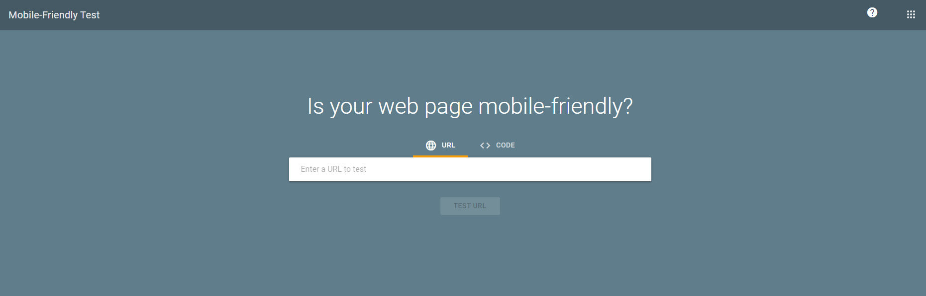
Use Google’s Mobile-Friendly Test tool
Google’s got your back, cobber. Use their Mobile-Friendly Test tool to see if your site makes the grade. Just pop in your website’s URL, and Google will tell you if it’s mobile-friendly or not. Easy as pie!
View your website on a variety of mobile devices and screen sizes
Don’t just rely on the tech giants to tell you what’s what. Get your hands on a few different mobile devices – phones and tablets – and check out how your site looks. Make sure it’s as smooth as a Bondi Beach wave on all of them.
Ask your friends and family to test your website on their mobile devices
Your mates and your rellies can be your best allies in this. Ask them to visit your site on their mobiles and give you honest feedback. They’ll tell it to you straight, no worries.
How to make your website mobile-friendly
Alright, let’s dive into the heart of the matter and uncover the essential steps to ensure your website is as mobile-friendly as a kangaroo’s pouch.
Use a responsive web design template or framework
Think of a responsive web design as the foundation of your website, like a sturdy dunny. It adapts to different screen sizes, making your site look spiffy on mobiles, tablets, and desktops. No need for a separate mobile site – one size fits all!
Make sure your text and images are large enough to be easily readable on mobile devices
Nobody likes squinting at their mobile screen, trying to read microscopic text. Make your fonts and images large enough to be seen without a magnifying glass. Your visitors will thank you for it.
Avoid using Flash and other outdated technologies
Flash might’ve been the bee’s knees back in the day, but it’s about as useful as a screen door on a submarine on mobile devices. Stick to modern, mobile-friendly technologies to keep your site running like clockwork.
Use a simple and easy-to-navigate menu
Aussies love things straightforward. Your website menu should be like a clear path in the bush – easy to follow. Don’t make users dig deep to find what they’re after. A tidy menu is a mobile-friendly menu.
Make sure your website loads quickly on mobile devices
Ain’t nobody got time for a website that loads slower than a snail racing uphill. Keep your site’s load time in check by optimising images and using efficient code. Mobile users are an impatient bunch – they’ll bounce if your site takes too long to load.
Photo Credits: Semrush Blog
Tips for a better user experience (UX) on mobile devices
Now that your website is looking stellar on mobile devices, it’s time to shift our attention to something equally important: the user experience.
1. Use large and clear fonts
Your fonts should be as easy to read as a street sign. Stick to simple, legible fonts, and avoid fancy cursive styles. Remember, clarity is the name of the game.
2. Make sure your buttons are large and easy to tap
Nobody wants to play a game of “pin the tail on the button.” Your buttons should be big enough for users to tap without accidentally hitting the wrong one. Keep them finger-friendly.
3. Avoid using pop-ups and other intrusive elements
Pop-ups can be as annoying as a blowfly at a barbie. If you must use them, make sure they’re easy to close and don’t cover the whole screen. Respect your visitors’ space.
4. Make it easy for users to find what they’re looking for
Navigation should be as smooth as a surfer catching a wave. Use clear headings and labels, and organise your content logically. Users should find what they want without getting lost in the outback.
5. Test your website thoroughly on mobile devices
Before you kick back with a cold one, give your website a thorough mobile test. Try different devices, screen sizes, and browsers. Make sure everything works like a charm.
Conclusion
Ensuring your website is mobile-friendly is crucial in today’s digital landscape. It’s akin to having a seamless conversation with friends – it should be effortless and comprehensible. And remember, a professional contractor should also have a well-designed website to showcase their services effectively. By adhering to these genuine tips, you’ll have a website that’s as mobile-friendly as a kangaroo in a pouch, which is bound to enhance your user experience (UX) and boost your search engine ranking.
So, go ahead and give it a try! Your website visitors will appreciate it, and you’ll be as pleased as can be with the results, just like a possum up a gum tree.
- Cost of Living Trends in Dallas for 2026Dallas has a reputation for being affordable compared to coastal cities, and for a long time that reputation held up pretty well. But 2026 looks a bit different. Prices across the board have shifted, some in ways people expected and some that caught newer residents... The post Cost of Living Trends in Dallas for 2026 […]